 Some time long ago, back when the last of the compact discs still roamed the earth, when Web 2.0 was first shimmying it’s glassy, bubbly, lime-green flippery toe out out of that primordial soup of long-shattered dotcom dreams, there was, at that time, The Tag Cloud.
And the Geeks saw the tag cloud. And the geeks said it was good.
And boy they were wrong about that. really wrong. And like Chlamydia, it spread.
Somehow this sexy-looking, but, -in reality- sordidly abused miscarriage of functional information design became the standard bearer of Web 2.0. Yep, pump up your form size elements, round those corners, slap tag Tag cloud on ‘er and you got yerself a Web 2.0 app.
So there was a reason. The reason is that tag clouds are supposed to convey a sense of “aboutness”. Oh are you new around here? here, take a glance at this, you can “see” what this place, person, blog, group, whatever is about by checking the tag cloud. Right…
But tag “clouds” suck. You can feel this is true in that pained space in your forebrain as your eyes grapple desperately to make sense of jumbled mess of disconnected semantics.
Tag clouds are like what if I said I was going to write this paragraph -but instead of in the regular order- I would put all of the words in alphabetical order instead. But then I’ll adjust the size of words I think are important in a highly arbitrary way. Wouldn’t that be awesome?!
I’ve not wanted to have to write this post for a long time. But people are *still* coming out with new sites loaded with tag clouds. So if you must have this feature to suggest “aboutness”, here’s what I would suggest (if this reminds you of last.fm there’s good reason, maybe the only sane tag using site on the internet)
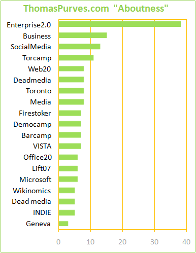
Let’s take technorati’s data and replot it:

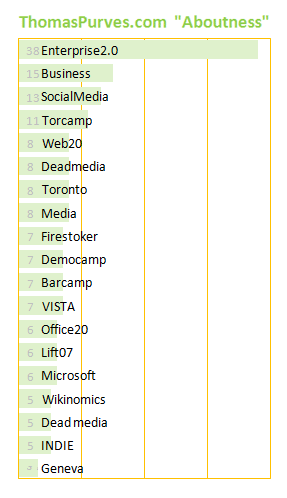
Hey now we can see not just what tags are more “about” this blog, but also in proper order, and by how much each differ. At a glance. If space is a premium, here’s how you might shave a few pixels and still convey all the data while squeezing it in a sidebar.

Anyway, this is my best efforts. let me know if you have inspirations.
File under “Tag Clouds: the Mullets of Web Design or Ontological Venereal Affliction?”

i agree. tag clouds are trendy, but they don’t actually convey that much useful or precise information.
i agree. tag clouds are trendy, but they don’t actually convey that much useful or precise information.
Well written post, but I have to disagree.
A bar graph may be more informative, but it is less space-efficient. As a user, I find tag clouds more usable than a simple list of categories, since the ones that stick out visually are the ones that are more important.
Well written post, but I have to disagree.
A bar graph may be more informative, but it is less space-efficient. As a user, I find tag clouds more usable than a simple list of categories, since the ones that stick out visually are the ones that are more important.
I agree and disagree. I think in concept it’s good, but poor in execution.
One type of tag cloud that I actually do like, and use regularly is news.com’s tag cloud.
It’s got a few downfalls in that it takes up a lot of real-estate, and the font used in the largest box is too big, but I do use it on a regular basis (whereas I completely ignore standard tag clouds)
I agree, they are useless. the bar graph is no better, i think the problem is, why do i want to see how popular these different descriptors are? I dont think its useful information regardless of how it is conveyed.
I agree, they are useless. the bar graph is no better, i think the problem is, why do i want to see how popular these different descriptors are? I dont think its useful information regardless of how it is conveyed.
This is SO true. I just stumbled upon your site and thanx to your blog, I now know what these useless “tag clouds” are actually called. 🙂
This is a great blog. I’m going to forward it to a few of my tech friends. I think that they may have already attended one of the demo camps that you speak of.
Best of luck and a great weekend to you!
I agree and disagree. I think in concept it's good, but poor in execution.
One type of tag cloud that I actually do like, and use regularly is news.com's tag cloud.
It's got a few downfalls in that it takes up a lot of real-estate, and the font used in the largest box is too big, but I do use it on a regular basis (whereas I completely ignore standard tag clouds)
Pingback: The Rintrarian » Tag Clouds – What are you about?
Totally agree, I’ve never clicked on a tag cloud and find them obnoxious